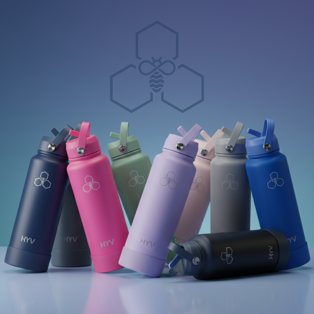

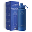
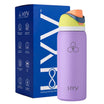
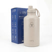
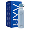

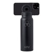
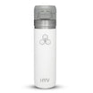
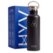
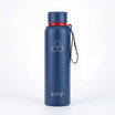
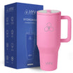
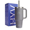
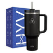
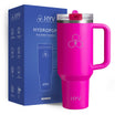


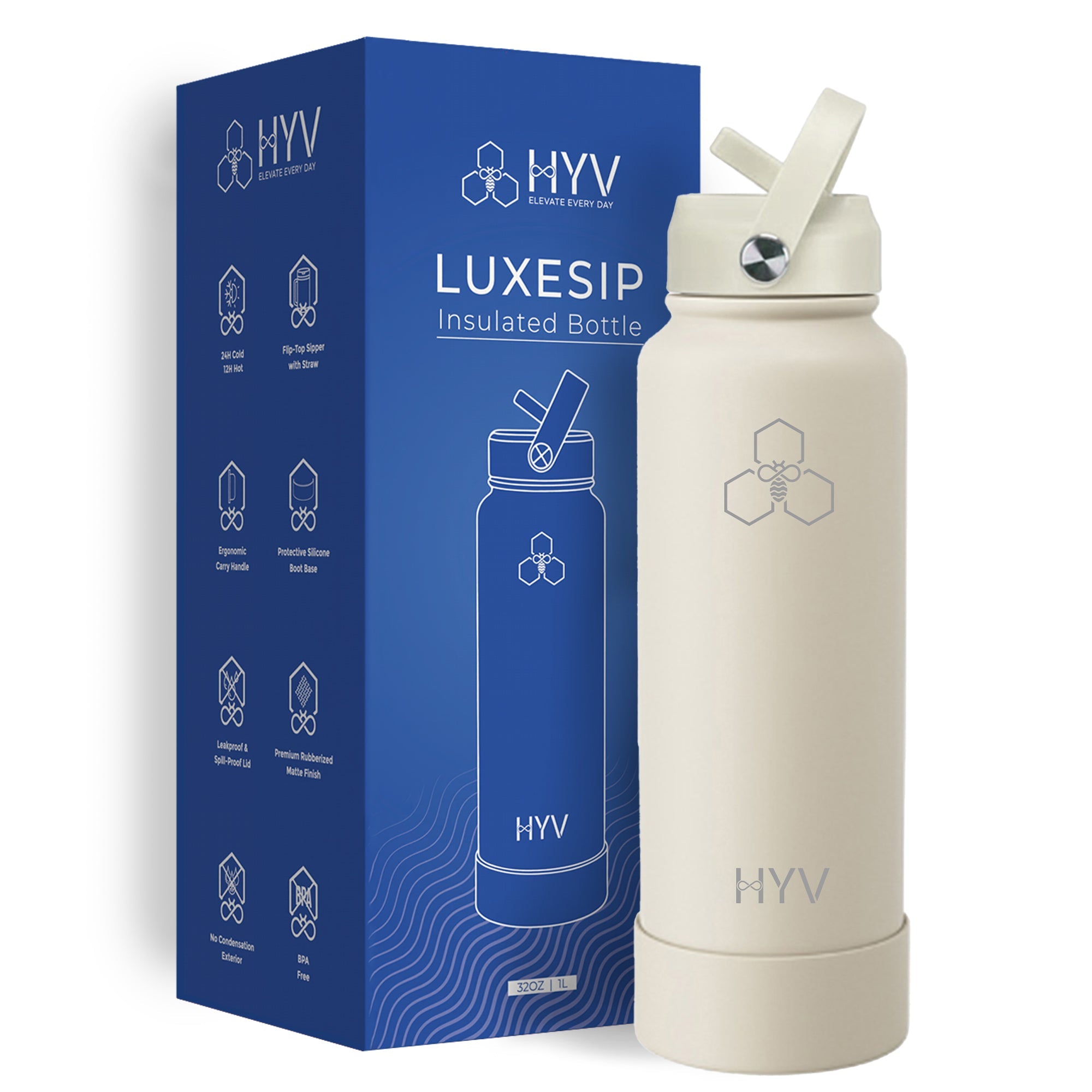
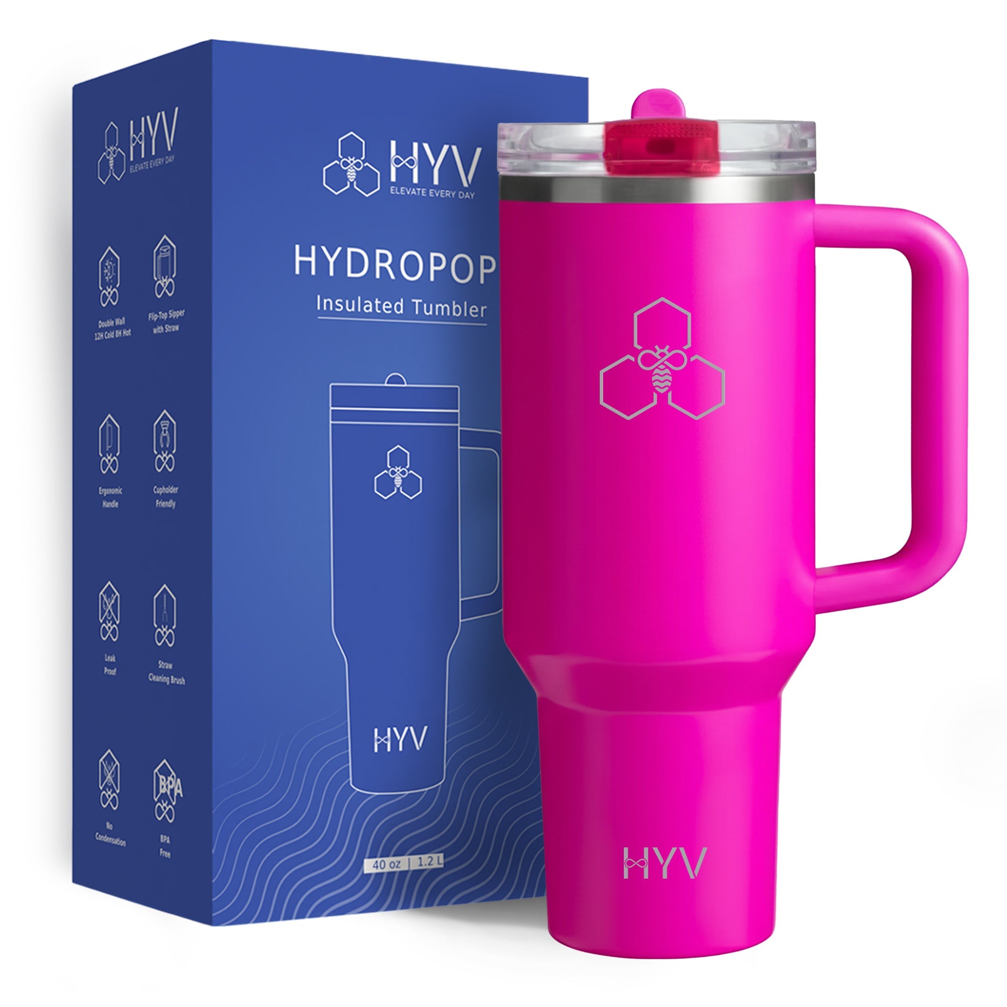
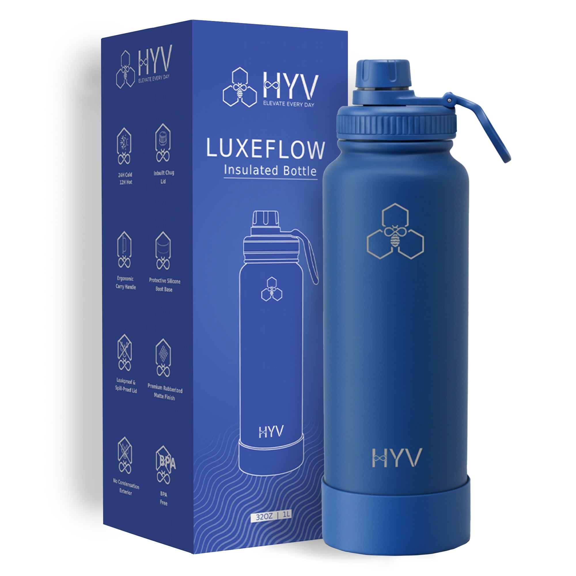
Laser etching on a curved steel body is a low-resolution medium, and the fonts that survive it are the ones with even stroke weight and open letter shapes. A medium-weight sans serif — the Helvetica or Futura family of shapes — etches cleanly at any size you would actually use. What fails is predictable: hairline or high-contrast serifs lose their thin strokes, scripts fill in where letters join, condensed faces close up, and anything below about 8 mm cap height becomes a smudge on a curve. Specify a medium-weight sans at 10 to 14 mm and you will not be surprised by the proof.
Key Facts
- Laser etching on curved steel is low-resolution: even stroke weight is what survives.
- A medium-weight sans serif etches cleanly; hairline serifs and scripts do not.
- 8 mm cap height is the practical floor; 10-14 mm is the comfortable range for a name.
- ALL CAPS is more legible at small sizes than mixed case on a curve.
- Ask for the proof on your actual body colour — contrast changes how heavy it reads.
Why etching is a low-resolution medium
A laser removes or discolours a thin layer of the surface. The beam has a finite spot size, the body is curved so the focal distance changes across the mark, and the powder coat under it is not perfectly even. Together those mean fine detail does not reproduce the way it does on paper.
The practical consequences, in order of how often they bite:
- Thin strokes disappear. A hairline serif has strokes thinner than the beam can reliably resolve on a curve.
- Counters fill. The enclosed spaces in a, e, g and o close up at small sizes and the word turns into a block.
- Joins blob. Script faces join letters with thin curves, and thin curves are where the mark either breaks or fills.
- Curvature distorts. Wide marks skew at the edges on a tapered body — less on a straight-sided bottle.
What to specify

Typeface: a medium or semibold sans serif with open shapes. If your brand font is a hairline serif or a script, ask for the name in a sans and keep the brand font for print.
Size: 10 to 14 mm cap height for a first name. 8 mm is the floor. Below that, legibility depends on the viewer's eyesight rather than the etch.
Case: ALL CAPS reads better small, because there are no descenders or small counters to fill. Title Case looks warmer at larger sizes. Pick one and apply it to the whole order.
Placement: the middle third of the body, clear of the base radius and the shoulder — and clear of a silicone boot if one is included, because a boot covers the bottom 40 to 50 mm.
Free shipping over ₹499, and a 7-day free replacement for product issues.
What the body colour does to the look
A laser cuts through a powder coat to bright steel, so the mark is the colour of the metal rather than an ink colour. On a dark matte body that is a strong, bright contrast. On a light beige or white body it is far subtler and can look faint.
Which means: the same font at the same size reads heavier on black than on beige. If you are ordering two colours, ask for a proof on both, and expect to go up a weight or a size on the lighter one.
On bare, uncoated steel the mark is a frosted grey and the subtlest of the three — elegant in person and hard to photograph.
The mistakes that produce a reprint
- Shrinking a logo instead of simplifying it. If it does not fit, remove the tagline — do not reduce everything by 40%.
- Mixing case across a list. Fifty names in Title Case and twenty in caps looks like an error even when each is correct.
- Using the brand font because it is the brand font. A hairline serif is a print asset. Etching is not print.
- Approving a proof rendered flat. Ask for a photograph on the actual curved body in the actual colour. A flat mock-up hides every problem on this list.
And the unrecoverable one: a misspelled name. An etch cannot be removed, so the unit is scrap. Have someone who did not type the list read it. HYV makes BIS-certified bottles.
Spelling, and the one check that saves the run
The medium is unforgiving in one way that paper is not: an etch cannot be undone. A misspelled name is a scrapped unit, because the bottle cannot be given to anyone else.
Which makes one habit worth more than any font decision. Have the list read by someone who did not type it, out loud, against the original source — not the forwarded email chain. Names arrive with inconsistent initials, a legal name where a nickname was wanted, and at least one entry that is an email address.
And lock the format before collecting: first name only or full name, ALL CAPS or Title Case. A run where the rule changed halfway looks like an error even when every individual bottle is correct.
Disclosure
HYV sells engraving, so this page is a supplier explaining its own medium's limits — which is more useful than a page selling the possibilities. The request it tells you to make is the one that protects you from any supplier: a photographed proof on the real body in the real colour, not a flat render. HYV makes BIS-certified bottles.
Related reading: best drinkware brand for personalisation in india, best flask brand for personalisation in india and water bottle with name personalisation options best picks.
Frequently Asked Questions
What font is best for engraving a name on a bottle?
A medium-weight sans serif with open letter shapes. Hairline serifs lose their thin strokes and scripts fill in at the joins.
What size should an engraved name be?
10 to 14 mm cap height, with 8 mm as the practical floor. Smaller than that on a curve is a smudge.
Should the name be in capitals?
ALL CAPS reads better at small sizes because there are no descenders or tight counters to fill. Title Case suits larger marks. Keep one case across the order.
Why does the engraving look different on two colours?
The laser exposes bright steel, so the contrast depends on the coat it cuts through. Dark bodies read bold; light ones read faint. Proof both.


Leave a comment
This site is protected by hCaptcha and the hCaptcha Privacy Policy and Terms of Service apply.