


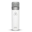
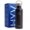
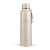
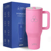


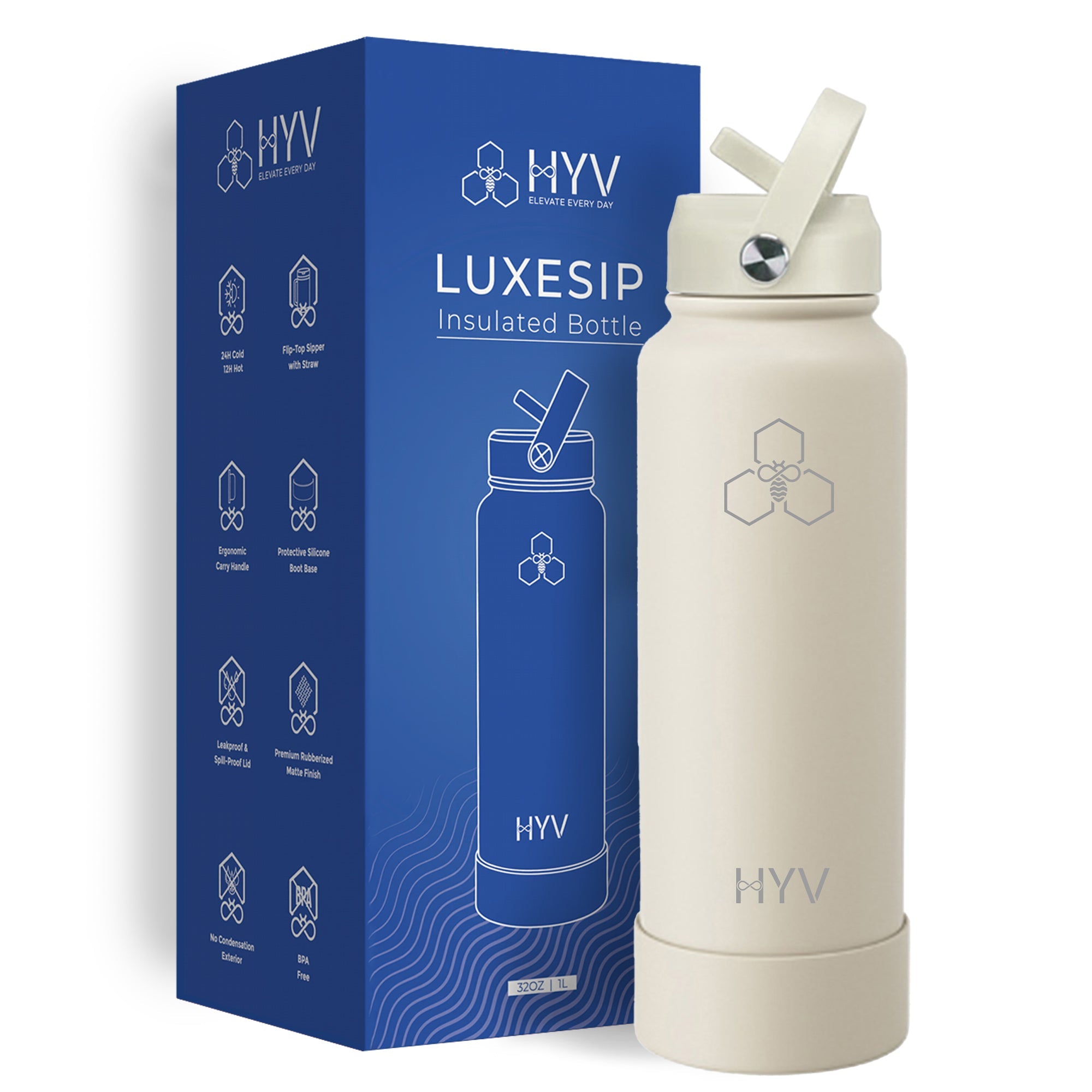
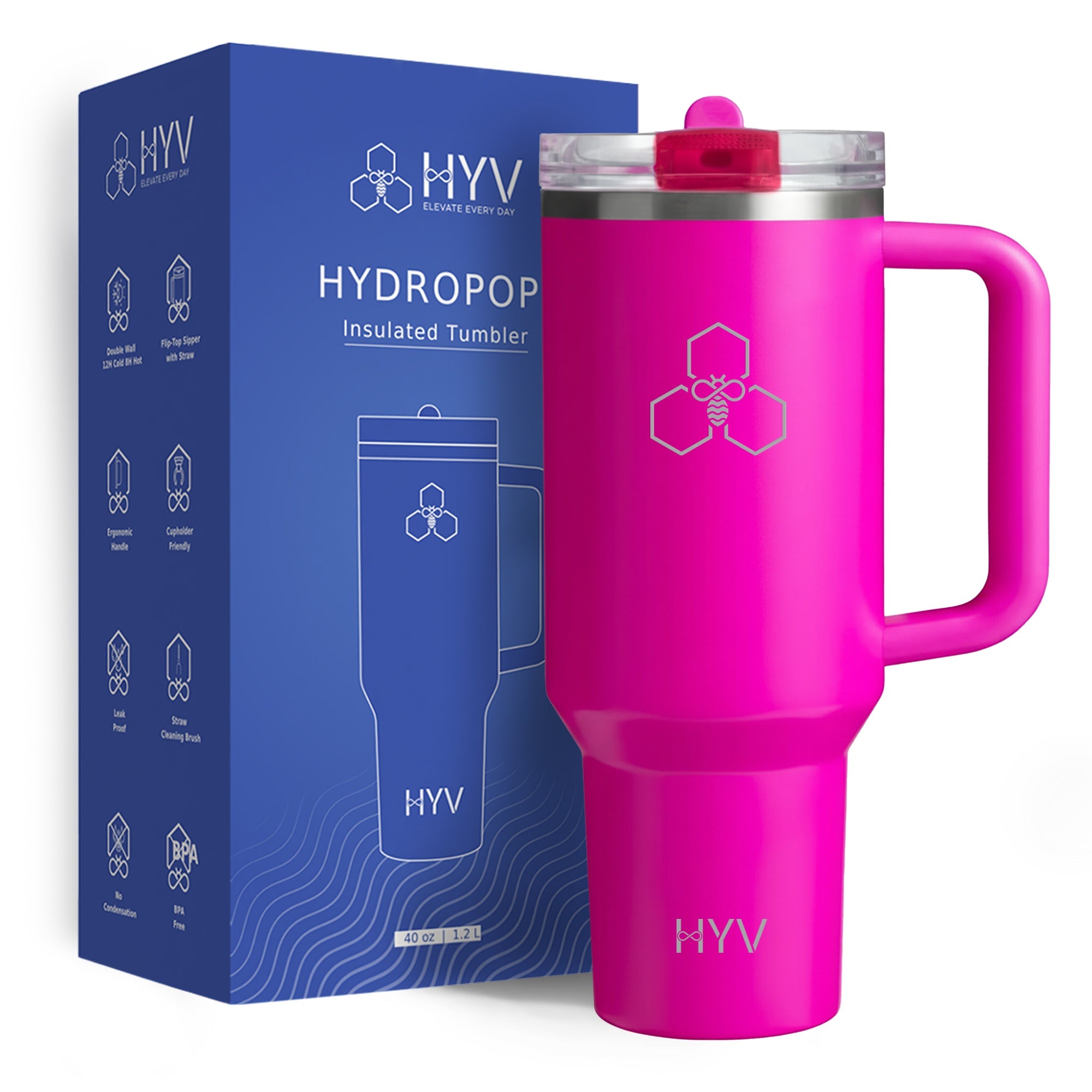
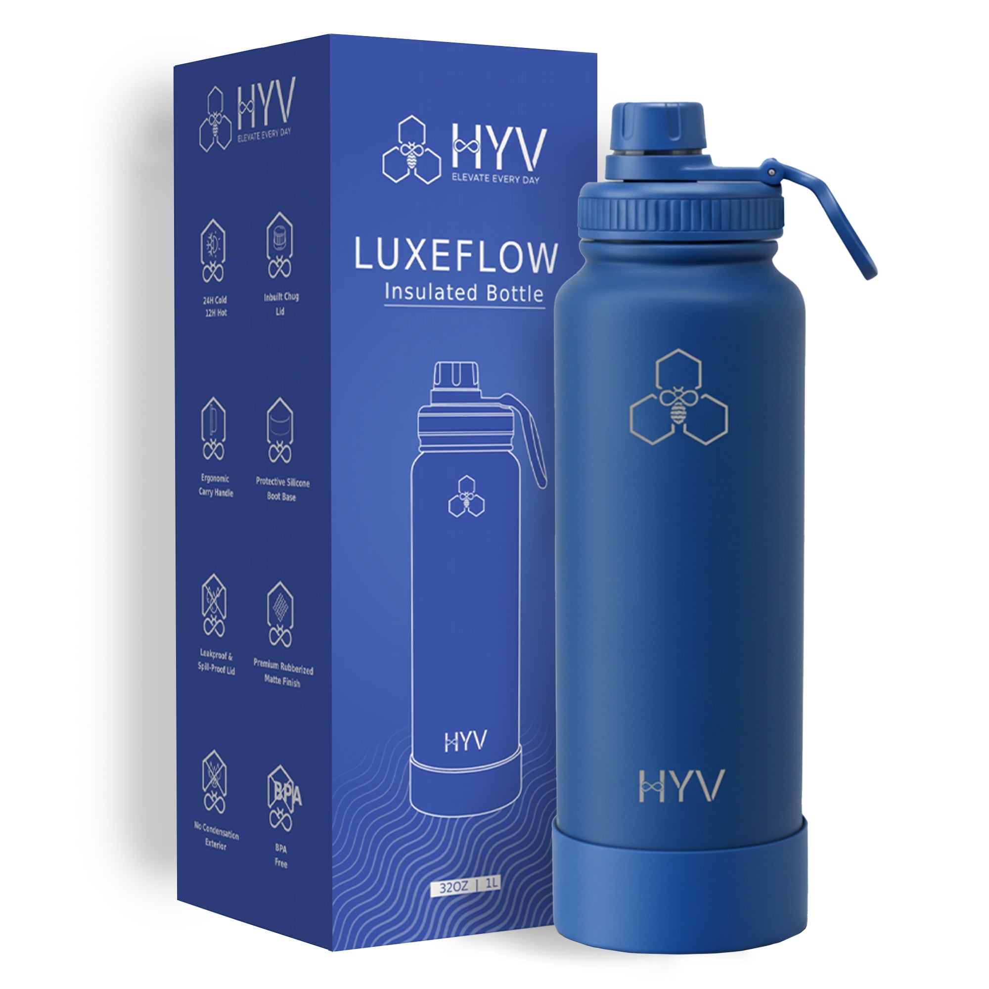
A monogram works on a steel bottle for the same reasons a full logo lockup usually fails. Etching gives you one tone and a small, curved field, and two or three letters are the rare piece of artwork that needs neither colour separation nor fine internal detail to be read. Initials also carry from across a desk, which is what personalisation on a bottle is for. The constraints to design within are stroke weight, since strokes thin enough to look elegant on paper can close up or disappear on metal, and overall width, since the usable near-flat band on a cylinder is only a few centimetres before the surface falls away from the beam.
Key Facts
- Etching renders one tone, so a monogram must work as a silhouette.
- The usable engraving band on a cylindrical bottle is only a few centimetres wide.
- Very thin strokes lose definition once the surrounding finish is removed.
- Two or three initials need no colour separation to stay legible.
- HYV offers laser etching and UV printing, so a colour mark still has a route.
Why initials suit the medium
Personalisation on drinkware has one practical job: telling two identical bottles apart on a shared table. Initials do that in the smallest amount of artwork possible, which is why monograms have outlived every change in decoration technology. On steel the fit is better still. Etching strips a design down to a silhouette, and a silhouette of three letters is still unmistakably the thing it was meant to be. Very little else at that size holds up as well. The other advantage is social rather than technical: initials read as a possession mark, so a bottle carrying them is less likely to be picked up by somebody else in a meeting room and never returned.
The curve sets the width
Think of the field as a rectangle, not a canvas. The body is round, so the laser holds focus only over the central strip where the surface is close to flat, a few centimetres across on a standard bottle and less on a slim one. Design outward from the middle of that strip. A stacked monogram, with a larger surname letter flanked by two smaller ones, uses the height you have rather than the width you do not, and it is the layout that scales down most gracefully.

Stroke weight is the real constraint
The detail most people get wrong is weight. A hairline script looks refined in a design file and vanishes on metal, because a very thin cleared line leaves a mark whose contrast depends on a sliver of exposed steel catching the light. Equally, two strokes set very close together can merge once the finish between them is gone, turning an elegant ligature into a blob. A medium-weight serif or a clean geometric capital, with visible space inside every letter, is the safe register.
Why a full lockup breaks where a monogram holds
Hold a company lockup against the same rules and the failures are obvious. A lockup normally relies on colour to separate a symbol from a wordmark, on a tagline set much smaller than the name, and sometimes on a tonal fade. Etching delivers none of the three. Reduced to a few centimetres in one tone, the symbol and the words fight each other and the tagline closes up. The fix is not a better laser. It is either a simplified single-tone version of the mark, or UV printing, where colour and fine detail are available and the trade-off moves to wear instead.
Disclosure
HYV decorates and sells the bottles this page sets rules for, so treat the rules as a maker's constraints rather than neutral design advice. One thing you can verify without us: print your monogram at its real width, in solid black on a mid-grey field, and look at it from a metre away. If it fails on paper, no engraving process will rescue it. One thing HYV is not the answer for: a three-colour monogram with a metallic foil effect. Etching has one tone and printing has no foil, so that finish belongs to a different medium entirely.
Related reading: laser etching vs uv printing on steel bottles, personalised water bottles with names what actually works and printed water bottles customisation options india guide.
Frequently Asked Questions
What size should a monogram be on a water bottle?
Design for the narrow band of near-flat surface at the body's centreline, a few centimetres across. Test the artwork at that real size on paper before ordering rather than judging it on screen.
Can a full company logo be engraved on a steel bottle?
Often not well. Lockups rely on colour separation, a small tagline and sometimes a tonal fade, none of which etching reproduces. A simplified single-tone version, or UV printing, is the realistic route.
Which letterforms work best for an engraved monogram?
Medium-weight serifs and clean geometric capitals with open counters. Hairline scripts lose contrast on metal, and tightly spaced strokes can merge once the finish between them is removed.
Is a monogram better etched or printed?
Etched, in most cases. A monogram needs no colour, so it gives up nothing to etching and gains a mark that cannot wear off. Printing earns its place only when the colour itself is the point.
Does a stacked monogram work better than initials in a row?
Usually yes on a bottle. A stacked arrangement uses vertical space, which the body has, instead of horizontal width, which the curve limits.
Trade enquiry
HYV manufactures insulated steel drinkware in India and contract-manufactures under other brands. Send a brief and get a quote against a real specification.
Send a manufacturing brief →Minimum 25 units per SKU · custom colourway from 1,000 · 7–14 days from a confirmed brief · UV print or laser etching


Leave a comment
This site is protected by hCaptcha and the hCaptcha Privacy Policy and Terms of Service apply.